This is my logo animation ver.2
I had drawn my portrait illustration myself before. I wanted to try to use that logo with this work.
Click this link to watch the video of my animated logo through Vimeo!!
my Animated Logo “hellokeitha” ver2
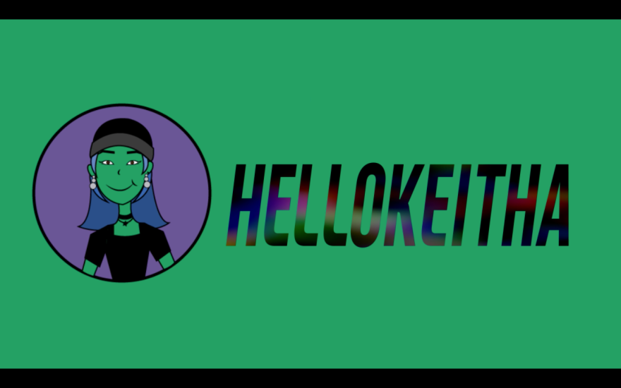

Yeonjoo (Keitha) Baek
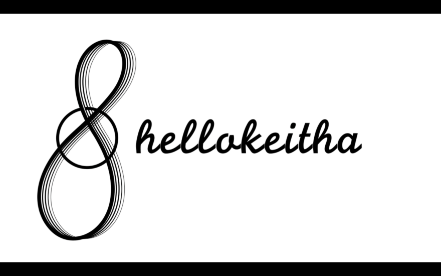
This is my logo animation ver.2
I had drawn my portrait illustration myself before. I wanted to try to use that logo with this work.
Click this link to watch the video of my animated logo through Vimeo!!
This is my logo animation.
Click this link to watch the video through Vimeo!!!
Street Fighter_ Green Screen Project
This short video is made by adobe premiere.
We had so much fun with green screen project.
screen shots:


*The sources (images, effects, sound, music) are brought from google and youtube.
Making Family Rules’ Poster was the one of our Design Principle assignment.

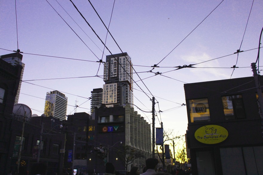
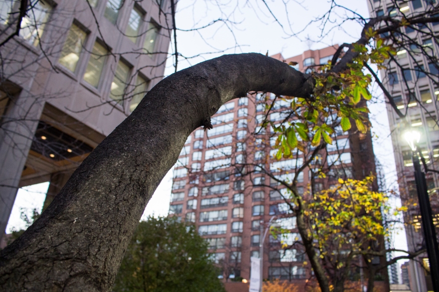
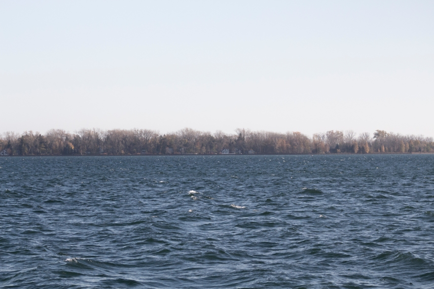
Downtown @ Toronto


My Backyard @ North York


I was studying about Adobe After Effects program, but suddenly wanted to put something important from my mind which is meaningful for everybody.
It is about the Sewol Ferry Disaster in South Korea in 2014.04.16 that we have to remember for a long time.
Many of young students had to gone helplessly under incompetent government.
As a Korean, I’m always so sorry and hope that all of people will remember that day and pray for them to be in peace now.
Love you all and I wish you guys are all together to not be scared anymore.
This was our first project from Media tools class in last semester which was about coloring character.
We were asked to bring main colors from other image and make our palette to color it.

I brought some colors from this image.

As a process, we had the black and white drawing image of ninja character.
Colored Flat firstly, and Shadow, and Highlights.


 This is my Layer.
Done!
With this project, we looked for a festival and made their main two poster with different sizes. I choose the Montreal Jazz Festival, and tried to make it colorful to express beautiful music.
In Addition, by using pen tool on Adobe Illustrator, I draw a Contrabass and Saxophone as a symbol of Jazz.


For this project, we need to make 3 page of Magazine by using Adobe InDesign Program.
I decided to make Fashion Magazine and this is what I did.
(We were asked to use dummy font with this project)


In photography class, we needed to take pictures of each subjects, such as, line, color, still life, shape, texture, architectural, portrait, landscape and also open.


What do you think about projection mapping?


The definition is, Projection mapping, also known as video mapping and spatial augmented reality, is a projection technology used to turn objects, often irregularly shaped, into a display surface for video projection. These objects may be complex industrial landscapes, such as buildings, small indoor objects or theatrical stages. By using specialized software, a two- or three-dimensional object is spatially mapped on the virtual program which mimics the real environment it is to be projected on. The software can interact with a projector to fit any desired image onto the surface of that object. (from Wikipedia)
Before I knew about this, I haven’t realized what exactly it is. But now I’m really interested in this subject so that I could have many possibilities which can make more creative works in future.
Those three videos are called as “Facial Projection Mapping”.
Plus, this video is about high-speed art projector which has the world’s fastest level of frame-rate that preserves 1,000 frames per second. They create the mapping system that can track objects moving at high speed.
Watch this awesome collaboration art work with Aya Bambi dancing duo. This can also show that developed technology such as, projector system opened the new door of performances field.
I have been learning how to use Adobe programs.
For this project, I used the Adobe Illustrator tool for reproducing a sports team logo.
I choose the BAKERSFIELD DRAGONS‘s logo for this project.
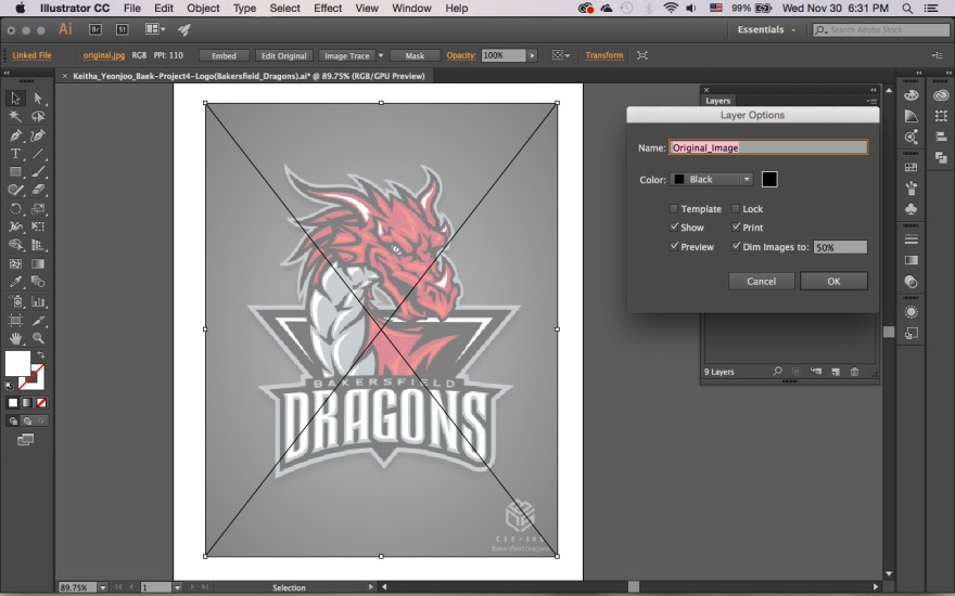
Firstly, I had to download the image on Illustrator, and change the Layer options brightly for drawing the outlines of image with pen tools.

I draw the outline of whole logo because this logo has the grey and the black color layers at the bottom.
However, they had a grey gradation in the middle of logo, so I had draw and fill it particularly.

After that, I draw and colored the inside part.
The dragon of this logo could be largely divided with Red colored part, Grey colored part and the black outlines which is very important.

This is the logo with all black lines. It has much more details now.

After that, I drawn the shadow parts and light parts. It gives more depth to this dragon.
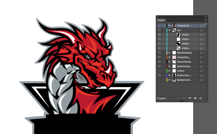
Now, I drawn the eye with this ways.
I made 4 layers as you can see in this screen shot.
This way could more clearly express the eye, and also easy way.
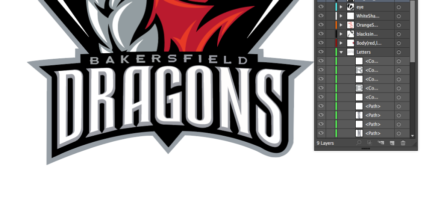 Finally, I draw the name of sports team.
It was layered by grey shadows and white letter.
So, I did the grey thing firstly, and then layered with the white part of letters.
Plus, I used the pathfinder for combining lines during to draw the letter part.

This is my layer lists.
By working on this project, I could learn how to use the pen tool in Illustrator.
It has many curved lines and details for me, but I think I did well and enjoyed this project 🙂
I will continue it.
Thanks!

